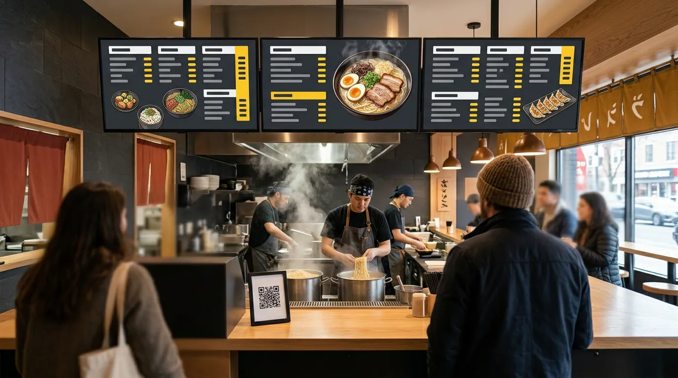
Menu Board Design Tips: How to Make Your Menu Easy to Read
You can have the best food in town and still lose sales to a confusing menu board.
If customers can't find what they want, can't read the prices, or can't tell what's popular, they hesitate. They order the safe choice, ask staff questions during the rush, or walk out. A well-designed menu board does the opposite: it helps people decide quickly and guides them toward the items you most want to sell.
Good menu board design isn't about being fancy. It's about being easy to read from a distance, in a few seconds, while standing in line.
Here are practical tips to make your menu board clear, readable, and effective.
1. Design for the Back of the Line
The most important rule: design for the customer furthest from the screen.
A menu that looks great on your laptop may be unreadable from 15 feet away. Before you finalize anything, put the design on the actual TV and read it from the back of your line or the far side of the room.
If you have to squint, so will your customers.
2. Use Big Enough Text
Digital menu board font size matters more than any other design choice.
A common rule of thumb is about 1 inch of letter height for every 10 feet of viewing distance, for the text you most need people to read. Item names and prices should be the largest text on the board. Descriptions can be smaller, but they should still be readable from where customers order.
If everything doesn't fit at a readable size, don't shrink it. Split the menu across more screens or cut items.
3. Limit Each Screen to a Manageable Number of Items
A board with 40 items is a wall of text. Customers can't scan it, so they don't.
Group your menu into categories and give each category its own space. If you have a large menu, use multiple screens: one for breakfast, one for sandwiches, one for drinks. Customers find what they want faster when there's less to search through.
4. Group Items Into Clear Categories
A clear menu layout follows the way customers think about ordering:
Breakfast, lunch, dinner
Sandwiches, salads, sides, drinks
Hot drinks, cold drinks, pastries
Use bold category headings so customers can jump straight to the section they want. Leave space between categories so they don't blur together.
5. Make Prices Easy to Find
Customers want to know what something costs. Make it easy.
For menu pricing display:
Line prices up in a consistent column or position.
Use the same style and color for every price.
For items with multiple sizes, use a simple grid with sizes across the top, instead of repeating prices for every item.
Skip unnecessary decimals if all your prices end in .00, or keep them consistent if they don't.
A bright accent color for prices, like yellow on a dark background, helps them stand out.
6. Use Strong Contrast
Low contrast is one of the most common menu board mistakes.
Light gray text on white, or dark text on a busy photo, might look stylish up close but disappears from across a room. High-contrast combinations like white text on a dark background, or black text on yellow, are much easier to read.
Our guide to the best colors for digital signage covers which combinations work best and which to avoid.
7. Stick to One or Two Fonts
Every font you add makes the board harder to read.
Use one clear, bold font for headings and item names, and at most one more for descriptions. Avoid script, handwritten, or decorative fonts for anything important. They're hard to read at a distance.
8. Use Photos Wisely
Food photos sell, but only when they help.
Use a few high-quality photos of your best or most profitable items.
Don't crowd the menu text to make room for images.
Make sure photos are bright, appetizing, and sized properly for the screen.
A single great photo of a featured item often works better than a dozen small ones.
9. Highlight What You Want to Sell
Your menu board can guide customers toward specific items.
Draw attention to your most popular, most profitable, or newest items with:
A "Popular" or "New" label
A larger photo
A box or highlight color around the item
Placement at the top or in the center of a section
Don't highlight everything, though. If every item is special, none of them are.
10. Keep Descriptions Short
Long descriptions slow customers down. A few words is usually enough:
TURKEY CLUB — roasted turkey, bacon, lettuce, tomato
Save the full story for your website or QR menu, where customers can read at their own pace.
11. Design at the Right Size and Shape
Design your menu at the same shape as your screen:
Landscape (horizontal) screens:
1920 × 1080pixelsPortrait (vertical) screens:
1080 × 1920pixels
A design made for the wrong shape will be stretched, squished, or cropped on screen.
12. Plan for Specials and Changes
A digital menu board's biggest advantage is that it can change.
Leave room in your design for a daily special or a seasonal item, or give specials their own slide that rotates with your menu. With Billiie Digital Signage, you can schedule your breakfast menu for the morning and lunch menu for midday, and set end dates so limited-time items disappear automatically.
13. Add a QR Code for Ordering
If you offer QR ordering, put a QR code on your menu board, usually in a corner where it doesn't cover menu items. Customers read the board from the line, then scan to order from their phone.
Billiie Digital Menu Ordering lets customers customize their order with toppings and extras and add notes, so the order arrives exactly as they want it.
14. Test It on the Actual TV
Every screen looks different. Colors, brightness, and sharpness can vary from what you see on your computer.
Upload your design, look at it in your store's real lighting, and read it from where customers stand. Adjust text size, contrast, and spacing until it works in person, not just on your monitor.
Menu Board Design Checklist
Readable from the back of the line
Item names and prices are the largest text
Clear categories with bold headings
Prices aligned and easy to find
High contrast between text and background
One or two fonts
A few strong photos, not many weak ones
Short descriptions
Correct size for your screen
Room for specials
Tested on the actual TV
Put Your Design to Work
A well-designed menu board helps customers decide faster, reduces questions at the counter, and steers attention toward the items you want to sell.
Ready to set one up? Follow our step-by-step guide on how to create a digital menu board, or see how restaurants use digital signage.
With Billiie, your first screen is free, forever. Create your Billiie account and put your new menu on screen today.

Ready to bring Billiie to your business?
Manage your screens, content, and locations from one simple dashboard.
No commercial signage hardware neededPowered by Billiie