Best Colors for Digital Signage: How to Choose Colors That Get Noticed
Imagine walking into a restaurant with two digital menu boards.
The first has a bright red background, yellow text, blue prices, and several different fonts. The second uses a simple black background, large white menu items, and yellow prices.
Which one would you find easier to read?
In most situations, the second design would be easier to understand. Not because black is always better than red, but because the colors work together instead of competing for attention.
Choosing the best colors for digital signage is about much more than making a screen look attractive. Colors influence readability, visual hierarchy, and how quickly someone can understand a message.
Unlike a website or printed brochure, digital signage is often viewed from several feet away. Customers may only glance at a screen while walking, shopping, ordering, or waiting.
A successful design needs to communicate in those few seconds.
This guide explains which digital signage colors work well, why certain combinations are easier to read, and how to choose colors for different businesses.
Why Colors Matter in Digital Signage
Color has three important jobs in digital signage design.
First, it helps people notice the screen.
Second, it makes information easier to read.
Third, it helps organize the message.
Consider a digital menu with 20 items. If every item, description, and price uses the same color and size, customers may struggle to locate what matters.
But if menu items appear in white, descriptions in a softer gray, and prices in yellow, the information becomes easier to scan.
This is called visual hierarchy.
Color helps guide attention toward the most important information without requiring additional words.
However, brightness alone doesn't guarantee effectiveness.
A screen filled with several highly saturated colors may attract attention initially while making the actual information difficult to understand.
The goal isn't to use the most colors.
It's to use the right ones.
1. Black Backgrounds With White Text
One of the most reliable digital signage color combinations is a black or very dark background with white text.
This combination provides strong contrast and allows images, prices, and accent colors to stand out.
It is particularly effective for:
Retail promotions
Barbershop service menus
Product advertisements
Modern office displays
For example, a restaurant could display menu items in white, prices in yellow, and section headings in neon green.
The background remains consistent while important details receive attention.
Recommended colors:
Background:
#111111Main text:
#FFFFFFAccent green:
#A3FF12Price yellow:
#FFD600
Dark backgrounds can also work well with food photography because colorful dishes stand out against the darker surroundings.
However, glossy screens may show reflections in bright environments, so always test the finished design under actual lighting conditions.
2. Yellow Backgrounds With Black Text
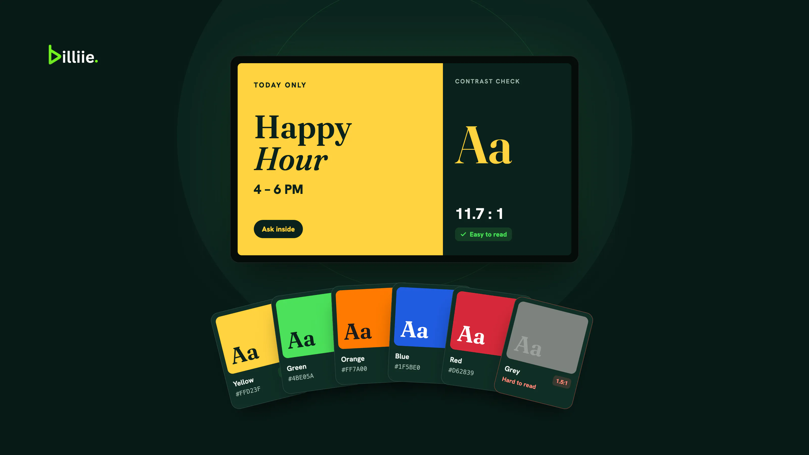
Yellow and black are another strong combination.
The difference between a bright yellow background and dark black lettering creates excellent visual separation.
This combination is particularly useful for businesses that want energetic, attention-grabbing designs.
Examples include:
Delis
Fast-food restaurants
Promotional displays
Limited-time offers
Imagine a yellow screen displaying:
CHICKEN OVER RICE — $8.99
With large black lettering, customers can quickly identify the item and price.
Recommended colors:
Background:
#FFDE38Text:
#111111
Avoid combining yellow backgrounds with white text, particularly when the yellow is very bright.
The colors can blend together and make important information difficult to read.
3. Red Backgrounds for Promotions
Red is commonly associated with urgency, energy, and attention.
That makes it a popular choice for promotional signage.
A red background with bold white text can work well for:
Flash sales
Limited-time promotions
Special offers
Clearance announcements
Holiday campaigns
For example:
WEEKEND SALE — 20% OFF — ENDS SUNDAY
A simple message like this can work well on a red screen.
However, red shouldn't automatically dominate every design.
If every promotion uses bright red, customers may become accustomed to it and stop treating it as something special.
Use red strategically.
Recommended colors:
Background:
#B91C1CText:
#FFFFFF
Also remember that red is frequently used for warnings and errors. Avoid creating unnecessary confusion in environments where safety information may also appear.
4. Blue Backgrounds for Professional Environments
Blue is often used in healthcare, education, corporate branding, and professional communication.
It can create a calmer visual appearance than highly saturated red or yellow.
That makes blue worth considering for:
Dental offices
Universities
Reception areas
A medical office might use a navy background with white text to display general wellness information or office announcements.
A university could use blue and white to communicate upcoming events.
Recommended colors:
Background:
#153F76Text:
#FFFFFFAccent:
#B9E5FF
Although blue is often associated with trust and professionalism, digital signage color psychology should not be treated as a universal rule.
People interpret colors differently depending on culture, experience, context, and brand familiarity.
Readability should always come before assumptions about emotional effects.
5. White and Cream Backgrounds for Clean Designs
Not every digital sign needs a dark or brightly colored background.
White, cream, and light gray can create an organized, understated appearance.
These colors can work particularly well for:
Real estate offices
Professional services
Boutique retailers
Hotel directories
Office announcements
Educational displays
A cream background with dark green or charcoal text can feel modern without overwhelming the viewer.
Recommended colors:
Background:
#F4F2EAMain text:
#1C2922Accent:
#326B4A
Light backgrounds are especially useful when the design includes structured information such as schedules, directories, or service lists.
The main consideration is avoiding low-contrast text.
Light gray lettering on a white background may look elegant on a designer's monitor but become difficult to read on a television across the room.
Understanding Digital Signage Contrast
Of all the principles in this article, digital signage contrast is one of the most important.
Contrast describes the visual difference between elements, especially text and its background.
High contrast generally improves the ability to distinguish text.
Low contrast can make content difficult to read, particularly at a distance.
Consider these examples:
White on black — strong readability
Black on yellow — strong readability
White on dark blue — strong readability
Dark charcoal on cream — strong readability
White on bright yellow — poor readability
Light gray on white — poor readability
Red on dark green — often difficult to read
For normal text, WCAG accessibility guidance commonly uses a contrast ratio of at least 4.5:1, with 3:1 for qualifying large text. These are useful design benchmarks, although physical signage also requires testing for viewing distance, glare, screen brightness, and other conditions.
A combination that technically meets a contrast guideline may still be difficult to read from 20 feet away if the text is too small.
That's why digital signage readability involves more than selecting two contrasting colors.
Best Colors for Digital Menu Boards
Restaurants have additional considerations because menu boards often combine text, prices, photographs, and multiple categories.
The best colors for digital menu boards should help customers find items and prices quickly.
A practical approach is to choose:
One primary background color.
One main text color.
One accent color for prices or important information.
For example, a deli might use black backgrounds, white item names, and yellow prices.
A café might prefer cream backgrounds, dark brown text, and muted green headings.
A fast-food restaurant might use yellow backgrounds, black text, and red promotional accents.
There's no universal winner.
The right combination depends on the brand, lighting, food photography, and viewing distance.
For more restaurant-specific advice, read our guide to digital signage for restaurants.
How Lighting Affects Digital Signage Colors
One of the most common digital signage design mistakes is creating a beautiful design without testing it on the actual television.
A design may look excellent on a laptop but appear very different when displayed in a bright store.
Several factors influence the result:
Ambient lighting: Strong overhead lights or sunlight can reduce perceived contrast.
Screen brightness: A dim screen may struggle in a bright environment.
Reflections: Glossy panels can reflect windows and lights, washing out parts of the design.
If your screen faces a bright window or sits under strong lighting, the display itself matters too. Our guide to consumer TVs vs. commercial displays explains when a brighter screen is worth it.
Choose Colors That Work on the Screen
The best colors for digital signage are the ones your customers can read at a glance.
Start with strong contrast, keep to one background, one main text color, and one accent, and save attention-grabbing colors like red for messages that deserve them.
Then test the finished design on the actual screen, in the actual lighting, from where your customers will stand.
With Billiie, you upload your finished designs and choose which screens show them — and your first screen is free, forever. Create your Billiie account and put your colors to work.


Ready to bring Billiie to your business?
Manage your screens, content, and locations from one simple dashboard.
No commercial signage hardware neededPowered by Billiie